


5.1. FREQUENCY DISTRIBUTION TABLE
In many real life situations, we have data in an unorganized form, which is called raw data.
To draw meaningful inference, we organize the data into systematic pattern in the form of frequency distribution table. Frequency can be represented in another way by putting bars as shown in the following table.
These bars are known as tally marks. The number of tallies for each group gives the number of students whose marks lie in that particular group. Suppose there are 5 students lying in a particular class interval. Therefore, it would be represented by

where four students are represented by four vertical bars as || and the 5th student is represented by a bar which cuts these four lines diagonally as .
Let us now go through an example to understand this concept better.
Example
Observe the given frequency distribution table and then answer the following questions.
|
Class interval (height in cm) |
Frequency (number of students) |
|
0 – 12 |
2 |
|
12 – 24 |
3 |
|
24 – 36 |
5 |
|
36 – 48 |
10 |
|
48 – 60 |
3 |
I. What is the size of the class intervals?
II. Which class interval has the highest frequency?
III. Which two classes have the same frequency?
IV. How many students have height less than 36 cm?
V. What is the lower limit of the class interval 24 – 36?
Solution
I. The difference between the upper and lower class limits for each class interval is 12. Therefore,
the class size is 12.
II. The class 36 – 48 has the highest frequency. 10 students’ heights belong to this category.
III. The classes 12 – 24 and 48 – 60 have the same frequency.
IV. The number of students having height less than 36 cm is 2 + 3 + 5 = 10.
V. The lower limit of the class interval 24 – 36 is 24.
5.2. FREQUENCY DISTRIBUTION TABLES FOR GIVEN DATA SET
The ages of some residents of a particular locality are given as follows.
7, 28, 30, 32, 18, 19, 37, 36, 14, 27, 12, 8, 17, 24, 22, 2, 21, 5, 21, 36, 38, 25, 10, 25, 9.
How will you represent this raw data in a systematic form?
We represent such type of data with the help of grouped frequency distribution table.
Let us now see how to draw it.
First of all, we will choose the class interval. In the given data, the minimum value is 5 and the maximum value is 38. We can take the class intervals as 0 – 10, 10 – 20, 20 – 30, 30 – 40 and obtain the number of residents falling in each group. All the given observations get covered in these four classes.
Now, the observations which are more than 0 but less than 10 will come under the group 0 – 10; the numbers which are more than 10 but less than 20 will come under the group 10 – 20 and so on.
We must note one thing, 10 occurs in two classes, which are 0 – 10 and 10 – 20. But it is not possible that an observation can be included in both classes. To avoid this, we adopt the convention that the common observation will belong to the higher class, i.e. 10 will be included in the class interval 10 – 20 and similarly we follow this for the other observations also.
The grouped frequency distribution table will be as follows.
The above frequency distribution table helps to draw many inferences such as the following.
The maximum number of people lies between the ages 20 and 30; 11 people are of ages less than 20, etc.
We can also tell the frequency, class limits, class size, etc. from the above frequency distribution table.
Let us now look at some more examples to understand the concept better.
Example
Construct a frequency distribution table for the given data of weekly income of workers by using class intervals
as 500 – 525, 525 – 550 and so on. The incomes for the 26 workers for a week are as follows.
540, 530, 545, 510, 520, 580, 570, 575, 555, 516, 527, 560, 550, 525, 535, 535, 565, 575, 585, 580, 560, 510,
515, 510, 520, 525
Solution
The class intervals to be used are 500 – 525, 525 – 550 and so on. Therefore, the class size is 25. The frequency
distribution table will be as follows.
Example
Observe the following distribution table
|
Class interval (height in cm) |
Frequency |
|
0 – 5 |
2 |
|
5 – 10 |
5 |
|
10 – 15 |
10 |
|
15 – 20 |
2 |
|
20 – 25 |
20 |
|
25 – 30 |
10 |
|
30 – 35 |
50 |
|
35 – 40 |
30 |
Form a frequency distribution table by taking the class intervals as 0 – 10, 10 – 20 and so on.
Solution
Here, in the first class interval 0 – 10, we have to include both the classes (0 – 5 and 5 – 10) of the given table and to find the frequency of class interval (10 – 20), we include the classes 10 – 15 and 15 – 20. In the similar way, we can form the whole table. Thus, the new frequency distribution table will be as follows.
|
Class interval (height in cm) |
Frequency |
|
0 – 10 |
7 |
|
10 – 20 |
12 |
|
20 – 30 |
30 |
|
30 – 40 |
80 |
5.3. CONSTRUCTION OF HISTOGRAMS
The frequency distribution table of the marks of 26 students in a particular subject is as follows.
|
Class interval (marks of students) |
Frequency (number of students) |
|
0 – 10 |
4 |
|
10 – 20 |
2 |
|
20 – 30 |
10 |
|
30 – 40 |
8 |
|
40 – 50 |
2 |
Can we represent this data graphically?
This data can be represented in the form of a histogram.
Now let us learn what a histogram is?
In a histogram, the data is represented in the form of bars of uniform width. The height of the bars shows the
frequency of class-interval.
Now, let us know how to draw the histogram.
We will represent the class intervals, i.e. the marks of students on the horizontal axis and the frequency, i.e. the number of students in a particular class-interval on the vertical axis.
The histograms are similar to bar graphs but the only difference is that there is no gap between the bars. This is because there is no gap between the class intervals and the data is continuous.
In the interval 0 – 10, the frequency is 4. Therefore, the height of the bar will be 4 along the vertical axis.
Similarly, the bars corresponding to the other frequencies are drawn.
The histogram for the given data is shown below (a).
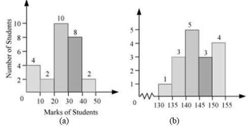
Now, consider another type of histogram shown above (b).
In this histogram, a jagged line ![]() or broken line has been used along the horizontal axis to indicate that we are not showing the data between 0 and 130.
or broken line has been used along the horizontal axis to indicate that we are not showing the data between 0 and 130.
Let us now look at an example to understand this concept better.
Example
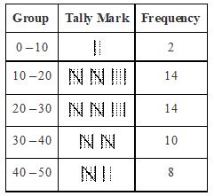
The given tally table represents the total runs scored by 39 batsmen in 10 different test matches.
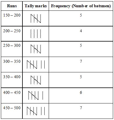
Draw a histogram for the above given distribution table.
Solution
In order to draw the histogram of the given frequency distribution table, we represent the runs on the horizontal axis and the number of batsmen on vertical axis. The height of each bar represents the frequency. The width of all the bars is same.
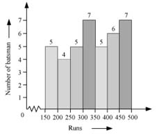
Here, we will use a broken line ![]() to indicate that the values between 0 – 150 are not represented.
to indicate that the values between 0 – 150 are not represented.
5.4. INTERPRETATION OF HISTOGRAMS
An histogram is one of the most important tool used for representation of data. One can interpret lots of information from a given histogram. So let us understand how to interpret information with help of the following example.
Example
The following histogram shows the age of the teachers in a school.
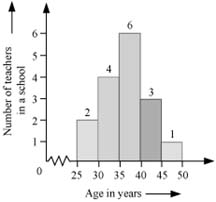
Observe the histogram and answer the following questions.
1. How many teachers’ age is 40 years or more but less than 45 years?
2. How many teachers are of age less than 40 years?
3. Which group contains the least number of teachers?
4. The age of maximum number of teachers lies in which group?
Solution
1. In order to find the number of teachers of the age 40 years or more but less than 45, we have to find the number of teachers in the age group 40 – 45. The number of teachers in the age group (40 – 45) is 3.
2. In order to find the number of teachers of age less than 40 years, we take into account the number of teachers of the age groups 25 – 30, 30 – 35, and 35 – 40. Thus, the number of teachers of age less than 40 years is 2 + 4 +6 = 12.
3. The age group 45 – 50 contains the least number of teachers.
4. The maximum numbers of teachers are in the age group 35 – 40.
5.5. CONSTRUCTION OF A CIRCULAR GRAPH
Sometimes, the data is represented using circles. For example, the circle given below shows various nutrients present in a chocolate.
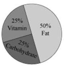
The representation of data in this form is called circle graph or pie-chart.
A circle graph shows the relationship between a whole circle and its parts. The whole circle is divided into sectors and the size of each sector is proportional to the information it represents.
Consider the following example to understand the drawing of a pie chart.
Example
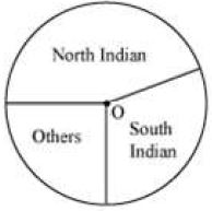
The choice of food for a group of people is given below.
|
Favourite Food |
Number of people |
|
North Indian South Indian Others |
50 40 30 |
|
Total |
120 |
Draw a pie-chart for the given data.
Solution
Firstly, we will find the central angle of each sector.
Here, total number of people = 120.
The central angle has been calculated in the following table.
|
Favourite Food |
Number of people |
In Fraction |
Central Angle |
|
North Indian Others |
50 |
||
|
South Indian |
40 |
||
|
Others |
30 |
Draw a circl e of any radius. Then, draw the angle of sector for the north Indian food, which is 150°. Use the protractor to draw the angle of 150°. Then continue making the remaining angles (120° and 90°). The pie chart has been shown as follows.
5.6. INTERPRETATION OF CIRCLE GRAPHS
The following pie-chart represents the percentage of number of students who come to school by bus, car, or bike. The number of students studying in the school is 5000.
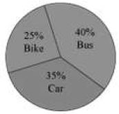
Can we find out how many students come by bike?
Let us see.
In the graph, the sector representing the number of students who come by bike is given to be 25%.
The total numbers of students are 5000.
Thus, number of students who come by bike =
Also find out how many students come by car and bus.
In the graph, the sector representing the number of students who come by car is given to be 35%.
Number of students who come by car = 35% of 5000 =
In the graph, the sector representing the number of students who come by bus is given to be 40%.
Number of students who come by bus = 40% of 5000 =
Which is the most common mode of transport?
Since the number of students coming by the bus is highest, bus is the most common mode of transport.
In this way, we can interpret the information given in a pie-chart or a circle graph.
Let us now look at one more example.
Example
Mr. Nair’s expenditure on various items and his savings for a particular month has been represented in the following pie-chart.
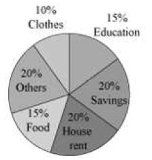
Observe the given pie-chart and answer the following questions.
1. On which of the represented items, the expenditure is least?
2. If the monthly savings of Mr.Nair is Rs 4000, then what is the monthly expenditure on food?
Solution
1. The expenditure is least on clothes. It is 10%.
It is shown in the circle graph that his savings is 20%. 20% represents Rs 4000.
15% represents Rs
Thus, the monthly expenditure on food is Rs 3000.
5.7. EQUALLY LIKELY OUTCOMES
There are many situations where on a particular day, you take a chance and the things do not go the way you want. However on the other days, they do.
For example, suppose Prachi takes her umbrella everyday to her office. However, on one day she forgot to take the umbrella and it rained that day.
Sometimes it happens that you leave home just 10 minutes before the school timings and still manage to reach at time. Whereas the other day, when you left home 30 minutes earlier, still you could not reach at time because of a heavy traffic jam.
In these kinds of examples, chances of a certain thing occurring and not occurring are not equal. But there are also some cases where there are equal chances of an event to occur or not to occur.
For example, suppose you play a game with your friend where you toss a coin to decide who will play first.
When you toss a coin, you can either get a tail or a head. There is no other possibility. Also, when you toss a coin, you cannot always get what you want out of Head or Tail. There are equal chances of getting a head or a tail. Such an experiment is called a random experiment. The results of an experiment are called outcomes of the experiment. Here, when you toss a coin, head or tail are the only two outcomes of this experiment.
Consider another example. Suppose you throw a dice while playing a game. There are 6 possible outcomes (1, 2, 3, 4, 5, or 6). There is no other possibility. Moreover, the chance of getting any of these outcomes is the same.
![]()
Let us note the results we obtain, when we throw a dice, once, twice, thrice, and so on. We will observe that as the number of throws increases, the chances of getting each of 1, 2 … 6 come closer and closer to one another.
That is the numbers of each of the six outcomes become almost equal to each other. In this case, we may say that the different outcomes of the experiment are equally likely, i.e. each of the outcomes has the same chance of occurring.
Let us now look at an example.
Example
Which of the following experiments results in equally likely outcomes?
1. The school bus of Archit comes daily on time but the day he reaches early, the bus comes late.
2. Tossing of a coin 10 times
Solution
1. The chances of the bus to come on time or not on time are not equal. Thus, this experiment does not result in equally likely outcomes.
2. The experiment of tossing a coin 10 times will result in equally likely outcomes, since there are equal chances of getting a head or a tail.
5.8. CHANCE AND PROBABILITY
Suppose India and Pakistan are playing a cricket match. Can we say that India will win the match?
We cannot say whether India will win or loose the match because it is just a matter of chance.
Now, consider another situation. Suppose the weather in Delhi is very cool for a week. Can we say that there will be a thunderstorm on one particular day of the week?
No, we cannot say anything about this situation.
These are the examples which involve chances of a certain thing happening or not happening. Also, these chances are not equal. But there are some cases where, for an event happening and not happening, there are equal chances.
Let us take an example of such a case.
Suppose you play a game with your brother where you toss a coin to decide who will play first.
When you toss a coin, there are two possible results- Head or Tail. There is no other possibility. Also, when you
toss a coin, you cannot always get what you want out of head or tail. There are equal chances of getting a head or a tail.
Probability of getting a head = probability of getting a tail =
The concept of probability can be used in real life as well. Let us see how.
In the beginning, we mentioned the situation of thunderstorm in Delhi. What will be the chances of this event in terms of probability?
If, suppose, the thunderstorm occurs on 2 days of the week, then, required probability
In this manner, the concept of probability can be applied in various situations.
5.9. OUTCOMES OF AN EXPERIMENT
Suppose Rahul is playing a game of ludo and he throws a dice
Can we tell what the possible outcomes are?
There are six possible outcomes of the above event. Rahul can get the numbers 1, 2, 3, 4, 5, or 6 on the top face of the dice.
Now consider another example. Suppose you toss a coin. Then, what are the possible outcomes of this experiment?
There are two possible outcomes. We can either get a head or a tail.
Both the outcomes are equally likely.
Each outcome of an experiment or a collection of outcomes makes an event.
Let us now look at some more examples and find the possible outcomes of an experiment.
Example
Two coins are tossed together. What are the possible outcomes?
Solution
When a coin is tossed, we can get a head or a tail. Therefore, if two coins are tossed together, the possible outcomes are
1. Two heads (i.e. heads on both coins)
2. Two tails (i.e. tails on both coins)
3. One head and one tail
Example
Suppose there are three pens of different colours in a box, out of which one is black, one is green and the third one is blue in colour. If a pen is drawn from the box, then what are the possible outcomes?
Solution
There are three possible outcomes which are as follows.
1. Black pen 2. Green pen 3. Blue pen
Example
In a bag, there are a total of four balls which are red, pink, yellow and blue in colour. If two balls are drawn out, then what are the possible outcomes?
Solution
The possible outcomes are as follows.
1. One red and one pink ball
2. One red and one yellow ball
3. One red and one blue ball
4. One pink and one yellow ball
5. One pink and one blue ball
6. One yellow and one blue ball
5.10.PROBABILITY OF EVENTS
Suppose Shashank throws a dice. There are six different outcomes. The outcomes of an experiment or a collection of outcomes makes an event.
In this example, getting the number 1 on the top face of the dice is an event. Similarly, getting the other numbers
(2, 3, 4, 5, or 6) are also known as events.
Can we tell what will be the probability of getting 2 on the top face of the dice?
Let us see.
There are six possible outcomes and all are equally likely to occur. The probability is the ratio of getting an outcome to the total number of outcomes.
Probability of an event =
Therefore, in the above example, the total numbers of outcomes are 6.
Probability of getting a number 2 on the top face =
What is the probability of getting 6 on the top face of the dice?
Since all the outcomes are equally likely to occur,
Probability of getting a number 6 on the top face =
Similarly, for other numbers (1, 3, 4, and 5) as well, the probability of showing up on the top face is .
This is how we can find out the probability of the occurrence of an outcome in an experiment.
Can we calculate the probability of the occurrence of a multiple of 3 on the top face of the dice?
Yes, we can.
Consider the multiples of 3 out of six possible outcomes. The multiples of 3 are 3 and 6 out of six possible outcomes.
Thus, probability of getting a multiple of 3 =
Now let us look at some examples.
Example
The given figure shows a wheel in which six English alphabets are written in six equal sectors of the wheel.
Suppose we spin the wheel. What is the possibility of the pointer stopping in the sector containing alphabet A?
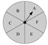
Solution
The total number of possible outcomes is 6. The pointer can stop at six different sectors (A, B, C, D, E, F).
Thus, probability of pointer stopping in the sector containing
Example
A bag has 6 blue and 4 red balls. A ball is drawn from the bag without looking into the bag.
1. What is the probability of getting a blue ball?
2. What is the probability of getting a red ball?
Solution
In a bag, there are 6 blue and 4 red balls.
Total number of outcomes = 6 + 4 = 10
1. Getting a blue ball consists of 6 outcomes, since there are 6 blue balls.
Probability of getting a blue ball =
2. Getting a red ball consists of 4 outcomes, since there are 4 red balls.
Probability of getting a red ball =
Example
When a dice is thrown, what is the probability of getting
(a) A prime number
(b) An even number
(c) An odd number
(d) A number less than or equal to 2
(e) A number more than or equal to 4
Solution
When a dice is thrown, the total number of outcomes is 6.
(a) The prime numbers out of six possible outcomes are 2, 3, and 5. Thus, getting a prime number consists of
3 outcomes.
Probability of getting a prime number
(b) Out of the possible outcomes, the even numbers are 2, 4, and 6. Thus, the number of outcomes of getting an even numbers is 3.
Probability of getting an even number
(c) The odd numbers are 1, 3, and 5. Thus, the number of outcomes of getting an odd number is 3.
Probability of getting an odd number =
(d) The numbers less than or equal to 2 are 1 and 2. Thus, there are 2 possible outcomes.
Required probability =
(e) The numbers more than or equal to 4 are 4, 5, and 6. Thus, there are 3 possible outcomes.
Required probability =