


14.1.INTRODUCTION
Everyday we come across a wide variety of information in the form of facts, numerical figures, tables, graphs, etc. These are provided by newspapers, televisions, magazines and other means of communication. These may relate to cricket batting or bowling averages, profits of a company, temperatures of cities, expenditures in various sectors of a five year plan, polling results, and so on. These facts or figures, which are numerical or otherwise, collected with a definite purpose are called data. Data is the plural form of the Latin word datum. Of course, the word ‘data’ is not new for you. You have studied about data and data handling in earlier classes.
Our world is becoming more and more information oriented. Every part of our lives utilises data in one form or the other. So, it becomes essential for us to know how to extract meaningful information from such data. This extraction of meaningful information is studied in a branch of mathematics called Statistics.
The word ‘statistics’ appears to have been derived from the Latin word ‘status’ meaning ‘a (political) state’. In its origin, statistics was simply the collection of data on different aspects of the life of people, useful to the State. Over the period of time, however, its scope broadened and statistics began to concern itself not only with the collection and presentation of data but also with the interpretation and drawing of inferences from the data. Statistics deals with collection, organisation, analysis and interpretation of data. The word statistics’ has different meanings in different contexts.
Let us observe the following sentences:
1. May I have the latest copy of ‘Educational Statistics of India’.
2. I like to study ‘Statistics’ because it is used in day-to-day life.
In the first sentence, statistics is used in a plural sense, meaning numerical data. These may include a number of educational institutions of India, literacy rates of various states, etc. In the second sentence, the word ‘statistics’ is used as a singular noun, meaning the subject which deals with the collection, presentation, analysis of data as well as drawing of meaningful conclusions from the data. In this chapter, we shall briefly discuss all these aspects regarding data.
4.2 Basic Definitions
Data
A collection of information in the form of numerical figures, is called data.
Example
The following table gives the data regarding the favorite sports of 140 students of a school.
|
Sports |
Number of students |
|
Cricket |
40 |
|
Football |
30 |
|
Tennis |
25 |
|
Badminton |
20 |
|
Volleyball |
25 |
Statistics
It is the science which deals with the collection, presentation, analysis and interpretation of numerical data.
Observation
Each numerical figure in a data is called a observation.
Raw Data
When some information is collected and presented randomly then it is called a raw data.
Example
The marks obtained by 10 students in a test are: 40, 32, 15, 36, 9, 23, 48, 25, 13, 27
Array
An arrangement of numerical figures of a data in ascending or descending order is called an array. Thus the above data may be arranged in an ascending order as: 9, 13, 15, 23, 25, 27, 32, 36, 40, 48
Range
The difference between the highest and the lowest values of observation in a data is called the range of the data. In the above data we have:
Lowest marks obtained = 9, Highest marks obtained = 48
Therefore range of the above data = (48 – 9) = 39
Tabulation of Data
Arranging the data in a systematic form in the form of a table is called tabulation of data.
Frequency of an Observation
The number times of a particular observation occurs is called its frequency.
14.3 Graphical Representation of Statistical Data
The tabular representation of data calls for close observation and cumbersome calculations to compare and study the given data. However, graphical representation of the same provides quick and interesting study of the given data and a curious glance can reveal several inferences. Thus, with the help of pictures or graphs, data can be compared easily. Though there are various types of graphs, in this chapter, we shall be dealing with the following:
• Pie Chart or Pie Graph
• Bar Graph or Column Graph
• Line Graph
Pie Chart
In a pie-chart, various observations or components are represented by the sectors of a circle and the whole circle represents the sum of the values of all the components. Clearly, the total angle of 360 at the center of the circle is divided according to the values of the components. Thus we have,
Central Angle for Component =
Some times, the value of components are expressed in percentages. In such cases, we have:
Central Angle for Component =
Steps of Construction of a Pie Chart for a given Data
Step1: Calculate the central angle for each component, using the above formula.
Step2: Draw a circle of convenient radius.
Step3: Within the circle, draw a horizontal radius.
Step4: Starting with the horizontal radius, draw radii making central angles corresponding to the values of the respective components, till all the components are exhausted.
Step5: Shade each sector differently and mark the component it represents. Thus, we obtain the required pie-chart for the given data
Bar Graph or Column Graph
Is a pictorial representation of numerical data in the form of rectangles (or bars) of equal width and varying heights. These rectangles are drawn at equal intervals. The height of a rectangular bar (or column) represents the frequency of the corresponding observation.
Steps of Construction of a Bar Graph for a Given Data
Step1: On a graph paper, draw a horizontal line OX (called x-axis) and a vertical line OY (called y-axis).
Step2: Mark point at equal intervals along the x-axis. Below these points, write the names of the data items whose values are to be plotted.
Step3: Choose a suitable scale. On that scale determine the heights of the bars for the given numerical values.
Step4: Mark off these heights parallel to the y-axis from the points taken in step 2.
Step5: On the x-axis, draw bars of equal width for the heights marked in step 4. These bars represent the given numerical data.
Line Graph
In a line graph, points are plotted on the graph paper related to two variables. These points are joined in pairs by lines to obtain a line graph.
Steps of Construction of a Line Graph for a Given Data
Step1: On a graph paper, draw a horizontal line OX (called x-axis) and a vertical line OY (called y-axis).
Step2: Mark points at equal intervals along the x-axis. Below these points write the names of the data items whose values are to be plotted.
Step3: Choose an appropriate scale along the y-axis taking into consideration the given values.
Step4: Mark off points parallel to y-axis from the point taken into step 2.
Step5: Join each point so obtained with the successive point with a straight line, using a ruler. Thus, we obtain the required line graph.
14.4.Construction of Histogram Of Different Class Intervals
A random survey of the number of persons of various age groups in a colony was found as follows.
|
Age (in years) |
0 – 5 |
5 – 10 |
10 – 20 |
20 – 40 |
40 – 50 |
50 – 80 |
|
Number of persons |
7 |
9 |
14 |
12 |
8 |
15 |
Using the fact that the length of the rectangles in a histogram is directly proportional to the corresponding frequency, the surveyor drew the histogram for this data as follows.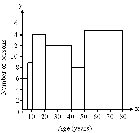
Do you think that this graphical representation of the given data is correct?
No, this graph is giving a misleading picture because the area of rectangles (not the length of rectangle) in a histogram is directly proportional to the corresponding frequency.
In case of equal class intervals, the width of each rectangle is same. While drawing the histogram, the surveyor did not notice that in this data, the class sizes of the class intervals are different.
In the given data, the class intervals are 0 – 5, 5 – 10, 10 – 20, 20 – 40, 40 – 50, and 50 – 80.
Each class interval is continuous as there is no gap between the consecutive class intervals. These class intervals do not have uniform class size as the class size of the class interval 0 – 5 is 5, whereas the class size of the class interval 10 – 20 is 10.
Here, since the class size is non-uniform, we cannot use our conventional method to construct the histogram.
Let’s see an example that helps us to understand the concept used for constructing histograms with non-uniform class size.
Draw a histogram for the marks of students in a class test using the following table.
|
Marks |
0 – 10 |
10 – 30 |
30 – 45 |
45 – 50 |
50 – 60 |
|
No. of students |
8 |
32 |
18 |
10 |
18 |
Here, minimum class size = 5
Thus, we can find the adjusted frequencies using the following formula
Adjusted frequency of a class
The calculation of adjusted frequency is given by the following table.
|
Marks |
Frequency |
Class Size |
Adjusted frequency |
|
0 – 10 |
8 |
10 |
|
|
10 –30 |
32 |
20 |
|
|
30 – 45 |
18 |
15 |
|
|
45 – 50 |
10 |
5 |
|
|
50 – 60 |
18 |
10 |
The histogram of the given data can be drawn as follows.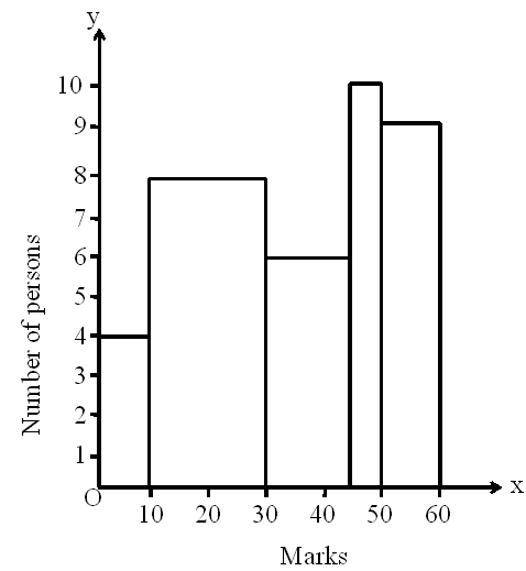
14.5. Interpretation of Histograms
Histograms are one of the most commonly encountered tools used for representation of data in statistics.
It is very important to be able to read histograms and interpret the data represented by them.
Now, let us look at one more example.
The given histogram shows the marks obtained (out of 100) by 42 students of a class.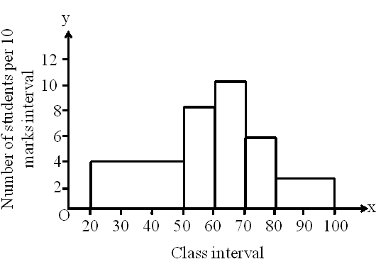
Which of the following statements is correct regarding the given histogram ?
A. The number of students whose marks were less than 50 is equal to number of students who got 70 marks and above.
B. The number of students whose marks are between 50 – 60 and between 70 – 80 is less than the number of students whose marks were less than 50.
C. The number of students whose marks are 80 and above is 3.
D. The number of students whose marks are between 70 – 80 is more than the number of students whose marks are 80 and above.
It can be seen that in the given histogram that the number of students is given per 10 marks interval. Therefore, we start by finding the number of students for the corresponding class intervals.
|
Class interval |
Number of students |
|
20 – 50 |
|
|
50 – 60 |
|
|
60 – 70 |
|
|
70 – 80 |
|
|
80 and above |
Number of students with 70 marks and above
= Number of students with marks between 70 – 80 + Number of students with 80 marks and above = 6 + 6 = 12.
Thus, statement A is correct.
Number of students with marks between 50 – 60 and 70 – 80
= Number of students with marks between 50 – 60 + Number of students with marks between 70 – 80 = 8 + 6 = 14
This is more than the number of students having marks less than 50.The number of students whose marks are 80 and above is 6.
The number of students having marks 70 to 80 is 6, which is same as the number of students having marks 80 and above i.e., 6.
Thus, all the other statements are wrong.
14.6.Construction of Frequency Polygons
Look at the following graph.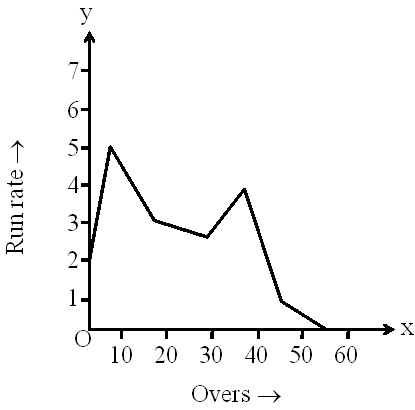
You must have seen such type of graphs during cricket matches. Such type of representation of a data is known as a frequency polygon.
Thus, frequency polygon can be defined as follows.
“A frequency polygon is a continuous curve. It can be obtained by plotting and joining the ordered pairs of class marks and their corresponding frequencies. One other way of drawing a frequency polygon is by joining the midpoints of the tops of the rectangles of a histogram and the mid-points of the classes preceding and succeeding the class intervals of the histogram”.
Let’s see the following examples to understand how a frequency polygon can be drawn.
Example 1
The weights (in kg) of newborn babies in a hospital in a particular week are as follows.
2.3, 2.0, 2.5, 2.7, 3.0, 3.2, 3.1, 2.2, 3.0, 2.5, 2.4, 3.0, 2.3, 2.4, 2.8
Draw the histogram and hence draw the frequency polygon for the given data.
Solution
The frequency distribution table of the given data is as follows.
|
Class interval |
Frequency |
|
2.0 2.5 |
6 |
The histogram and frequency polygon are shown in the following graph.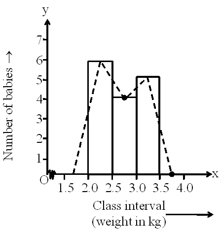
Example 2
Draw a frequency polygon for the following data without using a histogram.
|
Daily earnings (in Rs) |
300-350 |
350-400 |
400-450 |
450-500 |
500-550 |
|
Number of stores |
5 |
10 |
17 |
20 |
3 |
Solution
Firstly, we calculate the class marks and write the data as follows.
|
Class interval |
Class mark |
Frequency |
Points |
|
300 350 |
325 |
5 |
A (325, 5) |
The class interval preceding the lowest class is 250 – 300 and the class interval succeeding the highest class is 550 – 600. We assume the frequencies of these two classes as zero.
The class marks of the intervals 250 – 300 and 550 – 600 are respectively 275 and 575.
Now, by plotting and joining the points (275, 0), A, B, C, D, E, and (575, 0), we obtain the required frequency polygon as shown below.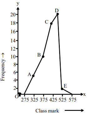
14.7 Mean
Many times, we hear such statements that the average of a student in the examination was this much or that the average runs scored by a player in a series is that much. What is the average that is talked about in such statements?
To understand this, let us see an example.
The score made by the two opening players of a team in 10 matches of a series are as follows:
|
Player A |
24 |
50 |
34 |
24 |
20 |
96 |
105 |
50 |
13 |
27 |
|
Player B |
26 |
22 |
30 |
10 |
42 |
98 |
40 |
54 |
10 |
122 |
Now, if someone asks whose overall performance is better, then how do we find it?
In the first match, the score of player B is higher than A and in the second match, the score of player A is higher than B and so on. Going by this logic, we cannot say anything about the overall performance. The only way to find the better performing player is to calculate the average score of each of them.
The player having the better average score would be the one who is performing better. Now, how can we find the average score of each of the players?
The given video will explain the formula and the method used to calculate the mean for such given data.
Sometimes the data given to us can be in frequency table format. So, let us look at the given video to understand the formula for calculating the mean of a data given in frequency table format.
Let us discuss some more examples based on calculation of mean of a given data.
Example 1
For what value of x is the mean of the data 28, 32, 41, x, x + 5, 40 equal to 31?
Solution
Mean of a given set of data
2x = 40
x = 20
Thus, for x = 20, the mean of the data 28, 32, 41, x, x + 5, 40 is 31.
Example 2
The numbers of children in five families are 0, 2, 1, 3, and 4. Find the average number of children. If two families having 6 and 5 children respectively are included in it, then what is the new mean?
Solution
We know that,
Mean =
When families with 6 and 5 children are added to this data, we will have the following data.
0, 2, 1, 3, 4, 6, and 5
New mean
Thus, 3 is the new mean.
Example 3
The average salary of five workers in a company is Rs. 2500. When a new worker joins the company, the average salary is increased by Rs. 100. What is the salary of that worker?
Solution
Let the salary of the new worker be Rs x.
Before the joining of the new worker, the mean salary of 5 workers is =
Sum of salary of 5 workers = 2500 × 5 = 12500 __________ (1)
When the new worker joined the company,
Number of workers = 5 + 1 = 6
The average salary is increased by Rs 100.
Average salary of 6 workers becomes
Rs (2500 + 100) = Rs 2600
Average salary of 6 workers
Rs 2600
x = Rs (15600 12500)
x = Rs 3100
Thus, the salary of the new worker is Rs 3100.
Example 4
If is the mean of the n observations , then prove that
Solution
It is given that is the mean of the n observations .
Thus,
Now,
= 0
Thus, the given result is proved.
14.8.Median
Suppose that there is a group of 9 friends in a school. Their total marks out of 1000 after the final examination are as follows.
658, 664, 651, 648, 755, 742, 662, 814, 764
Let us study an interesting term related to the distribution of marks, which is called median. Median defines the relative distribution of the data.
To find the median of the above data, first we have to arrange the given data in ascending or descending order.
On arranging the given data in ascending order, we have the following sequence.
648, 651, 658, 662, 664, 742, 755, 764, 814
Now, ”the value in the middle of the sequence is the median of the given data”.
Here, the value in the middle observation of the given data is 664. Therefore, the median of the given data is 664.
By looking at the data which is in ascending order, we can easily say that the marks of 4 students are less than 664 and 4 students have scored more than 664.
Therefore, we can say that the median divides the data into two equal parts.
Now, let us include one more student in this group who is the topper of the class and has scored 820 marks.
Median can be defined as follows.
Median is the value of the middlemost observation, when the data is arranged in increasing or decreasing order.
The method to find median can be summarized as follows.
Step 1: Arrange the data in increasing or decreasing order.
Step 2: Let n be the number of observations. Here, two cases arise.
Case 1:
When n is even, the median of the observation is given by the formula
Case 2:
When n is odd, the median of the observation is given by the formula
Let us discuss some examples based on medians of observations.
Example 1
Find the median of the observations 324, 250, 234, 324, 250, 196, 189, 250, 313, and 227.
Solution
On writing the observations in ascending order, we have the following sequence.
189, 196, 227, 234, 250, 250, 250, 313, 324, and 324
Here, number of observations n = 10, which is even.
Median = Mean of and observations
= Mean of and observations
Here, observation = 250 and observation
= 250
Thus, median =
Example 2
The daily minimum temperature (in °C) of 15 days of a city is recorded as follows:
4.5, 4.7, 3.9, 5.2, 5.0, 4.2, 4.6, 4.2, 4.2, 4.5, 5.7, 2.3, 6.0, 3.5, 4.0
Find the median of the minimum temperature of the city.
Solution
On arranging the data in ascending order, we obtain
2.3, 3.5, 3.9, 4.0, 4.2, 4.2, 4.2, 4.5, 4.5, 4.6, 4.7, 5.0, 5.2, 5.7, 6.0
Here, number of observations n = 15, which is odd.
Thus, median = observation
observation = observation = 4.5
Thus, the median of the minimum temperature was 4.5°C during those 15 days.
Example 3
The following observations have been arranged in ascending order.
11, 17, 20, 25, 39, 2y, 3y + 1, 69, 95, 112, 135, and 1204
If the median of the data is 53, then find the value of y.
Solution
The observations in ascending order are given as follows.
11, 17, 20, 25, 39, 2y, 3y + 1, 69, 95, 112, 135, and 1204
Here, the number of observations n = 12, which is even.
Median = Mean of
and observations
It is given that the median is 53.
53 = Mean of and observations
53 = Mean of and observations
53 = Mean of and observations
But and observations are 2y and 3y + 1 respectively.
53 =
106 = 5y + 1
5y = 106 – 1 = 105
y =
y = 21
Thus, the value of y is 21.