


1. INTRODUCTION
Sir Ronald Fisher introduced the concept of data handling or statistics. Indian mathematicians P.C. Mahalanobis and C.R. Rao have also played major role in the field of statistics. It is being used in all the fields like planning and projects, government budgets, population analysis, share market, student data analysis etc. Today it has developed as special branch of mathematics. Statistics can also be termed as data handling. It is a process of drawing facts from numerical data. It includes collection, presentation and interpretation of the data.
2. FUNDAMENTAL CONCEPTS
Data
Gathering information in the form of number or numerical figures is called data.
Eg:
• Number of boys and girls in a school
• Details of rain fall in various towns
• Information about population
• Students information in various categories
• No. of vehicles produced in different years etc…
Advantage of Collecting Data in Numerical Form
• It is easy to separate data into particular groups or categories
• It is easy to analyse and interpret
• It is easy to identify and find the values of required information.
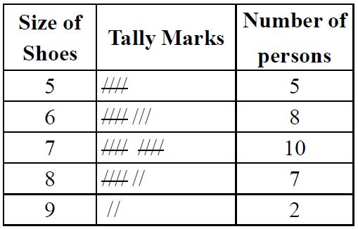
Tally marks
Tally marks are used to organise the observations. Record every observation by a vertical mark, but every fifth observation should be recorded by a mark across the four earlier marks, like this
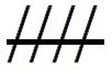
We depict each observation with the help of tally marks.
For Example, we have a group of persons and their sizes of shoes. The tabular form representing the tally marks is as shown here.
Range of Data
The difference between the maximum and minimum values of given data is range of data.
Eg: The marks obtained by 10 students of a class in mathematics in a unit test are as follows:
25,25,24,20,18,15,10,5,9,22
The highest mark = 25 and the lowest mark = 5
Therefore the range of marks = 25 – 5 – 20
Raw Data or Ungrouped Data
If the collected information is presented randomly then it is called raw data. i.e, collection of observation gathered initially is called a composite raw data.
Eg: The marks obtained by 30 students of a class in maths are as follows:
29,24,50,10,15,2,59,36,74,37,93,45,63,52,36,41,54,
37,83,51,29,36,51,47,83,78,88,47,41,91.
The above given initial or original form of data is called raw data. In above example queries like:
• How many have failed in exam
• How many got above 70 marks
• No. of students with average or good performance in the exam are difficult to analyse
Disadvantages of Raw or Ungrouped Data
• If no. of values are more, it is very difficult to analyse raw data.
• Identifying different categories of data in raw data is time consuming.
Grouped Data
If the raw data is classified or divided into groups or classes according to the requirement then it is called grouped data. Grouped data includes the terms; class interval, length of the class (or size of class interval) and frequency.
Class Interval
Dividing data into groups or intervals called class interval contains minimum and maximum value. These values are called as limits. Each class has lower limit and upper limit.
Lower and Upper Limit of a Class
The starting and end values of each class are called lower limit and upper limit respectively of that class.
Eg: If the class interval is 1-20, then the lower limit of class is 1 and upper limit of class is 20.
Note: The mid value of a class interval is called its class mark.
Class Boundaries
The average of upper limit of a class and the lower limit of the succeeding class is called upper boundary of that class. The upper boundary of a class becomes the lower boundary of that next class.
Length or Size of the Class
The difference between the upper and the lower boundary of a class is called length of the class or size of the class.
Eg: Class intervals of marks and no. of students in each of the categories are as follows.
|
Marks |
Frequency |
|
1-20 |
4 |
|
21-40 |
8 |
|
41-60 |
12 |
|
61-80 |
40 |
|
81-100 |
25 |
In above table:
• 1 – 20, 21 – 40, 41 – 60, 61– 80, 81 – 100 are called class intervals.
• 1, 21, 41, 61, 81 are lower limits and
• 20, 40, 60, 80, 100 are called upper limits.
Procedure to find Size of Class
Upper bound of class (1 – 20) = Avg (upper limit of class 1 – 20 and lower limit of class 21 – 40)
Upper bound of class 1 – 20 = 20.5
Hence lower bound of class = (21 – 40) = upper bound of class 1 – 20
Now upper bound of class(21 – 40) = Avg(upper limit of class 21 – 40 and lower limit of class 41 – 60)
Hence upper bound of class(21 – 40) = 40.5
Now the length of the class(21 – 40) = Upper boundary of (21 – 40) – lower boundary of (21 – 40)
= 40.5 – 20.5 = 20
Therefore length of the class 21 – 40 = 20
Since the length of each class interval should be equal.
Therefore lengths of class or size of class of given table.
Frequency of a Class
The number of times a particular observation (or value) occurs in each class interval is called frequency of a class. When dividing data into grouped data, a line drawn for each observation in a class interval. These lines are called as “tally marks”. It is denoted by ‘1’. The number of tally marks in each group gives the number of observations in that class interval. This is called frequency of marks in each class will be the frequency of that class.
Steps followed when preparing the Grouped Data
Step-1: Find the range
Step-2: The lowest and highest values of data should be covered in the classes
Step-3: The length of class should be the same for all classes
Eg:
• 1-10, 11-20, 21-30,……
• 10-14, 15-19, 20-24, …..etc
Taking classes like 1-9, 9-15 is wrong
Step-4: Tally marks should be marked for each class. After every 4 tally marks 5th tally mark should be crossed for convenient of counting
Advantages of Grouped Data
• Collection of data in the form of numerical figures
• The data can be grouped and presented with clarity
• It is easy to analyse and interpret the data
• New discoveries can be made and estimation can be done
Arithmetic Mean
Arithmetic mean is a number that lies between the highest and the lowest value of data.
Note: that we need not arrange the data in ascending or descending order to calculate arithmetic mean.
Mode
Mode refers to the observation that occurs most often in a given data. The following are the steps to calculate mode:
Step-1: Arrange the data in ascending order.
Step-2: Tabulate the data in a frequency distribution table.
Step-3: The most frequently occurring observation will be the mode.
Median
Median refers to the value that lies in the middle of the data with half of the observations above it and the other half of the observations below it. The following are the steps to calculate median.
Step-1: Arrange the data in ascending order.
Step-2: The value that lies in the middle such that half of the observations lie above it and the other half below it will be the median.
The mean, mode and median are representative values of a group of observations or data, and lie between the minimum and maximum values of the data. They are also called measures of the central tendency.
3. PICTORIAL REPRESENTATION OF DATA
The numerical data is represented through pictures or diagrams then it is called pictorial representation of data. The pictorial or visual representation for easy understanding a given data is called graph. We have different types of graphs.
• Picture graph or pictographs
• Bar graph or bar diagrams or column graph
• Pie graph or pie diagrams
• Line graphs
Pictographs
Graphs which use pictures of objects or parts of objects is called pictograph or pictogram. In representation of data each picture represents only one object.
• In a pictograph sometimes a symbol of picture or object may represents multiple units.
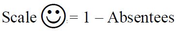
• A rule that one picture of a object represents more objects is called scale of pictograph.
Eg. 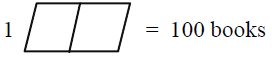
If it is half book like whose value is = 50 books.
Steps to Follow while drawing Pictographs:
• All the pictures should be of same size
• The scale should be selected carefully to suit our requirement
• If half the picture is being used, the details should be mentioned clearly
• The picture should be neat and attractive
• The diagram should have a suitable and short heading
Eg: The following pictograph shows the number of absentees in a class of 30 students during previous week.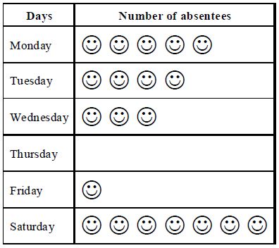
(i) On which day were the maximum number of students absent.
(ii) Which day had full attendance.
(iii) What was the total no. of absentees in that well
Sol:
(i) Maximum absentees were in Saturdays since there are 7 pictures in the row for Saturday.
(ii) No one is absent on Thursday, since there is no picture against Thursday
(iii) The total number of absentees in that week was 20. Since there are total 20 pictures.
Disadvantages of Pictographs
• Drawing pictographs is difficult and time consuming
• Showing the whole information through pictograph is not possible always.
Eg:
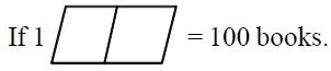
Then we can easily represents 50 books = but it is difficult to represent 46 books. Since there is no picture to represent 46 books.
Bar graph or Column Graph
Representing data using pictographs is not possible in all cases, some other way of representing data is bar diagrams or column diagrams. Representing the data with the help of bars or representing in a diagram is called a bar graph or bar diagram.
• Each bar represents only one value of the data, hence there are as many bars as there are values in the data. Therefore no. of bars = no. of items
• While drawing bar graph, the line drawn vertically is called y-axis and the line drawn horizontally is called x-axis
• All bars should rest as same line called the base either on x-axis or y-axis
• The bars can be drawn either horizontally or vertically. The bars which are having base as x-axis are vertical bars and the bars which are having base as y-axis are horizontal bars
• The length of the bar represents the values of the item
• The (breadth) width of the bar does not represent any item. So that the width of all the rectangles (bars) is to be same for attractive graph
• The distance between any two bars should be the same
• The bars can be shaded with dots, lines or colours to make them attractive
• While drawing bar graph the original values of the data cannot be shown in the graph. So that 1cm will be taken as a few units which is called scale of bar graph
Eg: The marks obtained by bhargav in his annual examination are given as
|
Subject |
Marks obtained |
|
Hindi |
65 |
|
English |
70 |
|
Maths |
85 |
|
Science |
55 |
|
Social studies |
60 |
then corresponding bar diagram can be drawn as follows.
Steps in drawing a Bar Graph
1. Draw a horizontal and vertical lines which are named as x-axis and y-axis on a graph paper.
2. Take the scale on y-axis as 1cm = 10 marks
3. Take marks obtained along y-axis and subject names on x-axis
4. Draw rectangles corresponding to given data. While drawing rectangles each rectangle should have same width and distance between any two rectangles should be equal.
5. Now we can find length of each bar
No. of marks in Hindi = 65
As per scale 10 marks = 1cm,
Therefore 65 marks =
Similarly no. of marks in English =
No. of marks in Mathematics = 85 =
No. of marks in Science =
No. of marks in Social =
Now we can draw bar graph for above data using step1 to step 4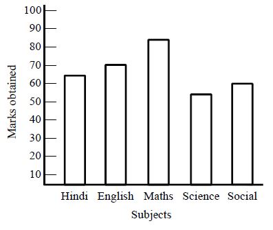
Advantages of a Bar graph
• Bar diagrams are simple to draw
• Bar diagrams provide easy comparison of the given data.
Pie Graph or Pie-Diagram
In a pie-diagram, each observation is represented by the sector of a circle. The circle as a whole represents the total of the components. The pie diagram is drawn by first drawing a circle of suitable radius and then dividing the angle of at its center in proportion to the values of the various components. The areas of various sectors are in proportion to the angles which they make at the centre of the circle. Thus the areas of the sectors made from the circles are in proportion to the values of the components. The pie-diagram is advantageous to draw when we wish to compare items of the same form or when the absolute values in the data are not given but only proportional or percentage values are given.
Steps to draw Pie-Diagram
Step-1: Find aggregate of all components and then by using the following formula
Sectorial angle for a given observations
Step-2: Draw a circle of suitable radius to get the angles corresponding to different components
Step-3: Write the title either on top or at the bottom
Eg: Santosh earns Rs. 12000 per month his expenditure on various items during a month is as follows:
|
Item |
Amount spent |
|
Found |
Rs 2500 |
|
House rent |
Rs 1800 |
|
Bike Maintenance |
Rs 2400 |
|
Savings |
Rs 3000 |
|
Misc |
Rs 2300 |
Pie-chart to represent the above data as follows
Step-1: Aggregate of all components = 12000
Sectorial angles corresponding to given data items are
Sectorial angles for food items are
Sectorial angles for house rent =
Sectorial angles for bike maintenance
Sectorial angles for savings
Sectorial angles for miscellaneous =
Step-2: Now we can draw a circle of suitable radius
Step-3: Now we can draw sectors with angles at centre are 75°,54°,72°,90°,69° respectively as shown in the figure.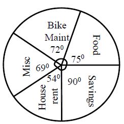
Note: While drawing pie chart, we can take horizontal radius as base line drawn an angle at the center equal to the degree represented by first component then by taking second line as a base draw an angle equal to the degree of second component and so on till all the components are completed.
Line Graph: In a line graph, points are plotted on the graph paper related to two variables. These points are joined in pairs by lines to obtain a linegraph. Linegraph is useful for displaying data or information that changes continuously overtime. Another name for a line graph is a line chart. Line graph has various parts named as tittle, labels, scales, points and lines. They are defined as follows
• Tittle : The tittle of the line graph tells us what the graph is about
• Labels : The horizontal label across the bottom and the vertical label along the side tells us what kind of facts are listed.
• Scales : The horizontal scale across the bottom and the vertical scale along the side tell us how much or how many
• Points : The points or dots on the graph show us the facts about given data i.e., the increase or decrease in required components.
Step for Constructing of Line Graph
Step-1: Find the range of two sets of values.
Step-2: Determine scales. Scales will be depending on greatest values of two sets of components. If we are using graph paper, start with horizontal scale. Let 1cm on the graph paper equal to 1 unit value of given components. While taking scale, we should observer that whether the greatest value will fit on the graph. Continue this process for vertical scale also.
Step-3: Label the graph by the units, they represent to mark each unit across horizontal scale and along the vertical scale.
Step-4: Plot the points and connect them. Plot a point for each pair of values with items of a pair is indicated by the horizontal scale and by the vertical scale. Then connect the points with straight lines from left to right.
Step-5: Finally we can give the graph title.
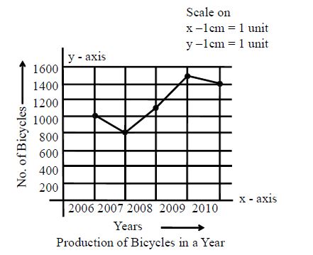
Eg: The number of bicycles manufactured by a company during the year 2006 to 2010 are given in the following table
|
Year |
2006 |
2007 |
2008 |
2009 |
2010 |
|
No. of bicycles |
1000 |
800 |
1100 |
1500 |
1400 |
The line graph for above data as follows:
Step-1: Find range in values of years and no. of bicycles.
Range of years = 2010 – 2006 = 4 years
Range of no.of bicycles = 1500 – 800 = 700
Step-2: Now determine the scales which are suitable and fit for graph along x-axis and y-axis.
Scale on x-axis 1cm = 1 units of year; scale on y-axis 1cm = 200 bicycles.
Step3: Label the graph along x-axis and y-axis as follows:
x-axis as “years”; y-axis as “no.of bicycles”
Step-4: Now plot the points for each pair of values of years and no. of bicycles and then connect the points with straight lines.
Step-5: Finally given the title for graph as “production of bicycles in a year”
The following figure shows line graph