


15.1 INTRODUCTION
Graphs are the visual form of a numerical data and drawn to understand the data easily, quickly and clearly. In earlier classes, we have represented the data through various kinds of graphs, namely Pictograph, bar graph, pie graph and histogram.
- In a pictograph, a picture or symbol is used to represent a certain quantity.
- In bar graph, the length of each rectangular bar is proportional to the frequency of the class it represents.
- A pie graph is used to compare parts of a whole.
- A histogram is a bar graph that shows data in intervals.
There is also another way of expressing a numerical data in graphical form which is known as line graph
15.2 A LINE GRAPH
A line graph displays data that changes continuously over periods of time. Let us look at the graph as shown in the following figure.
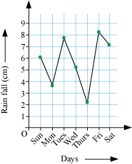
As shown in the given graph, the amount of rainfall received on different days of the week is shown by the points. These consecutive points are joined to form a zig-zag shaped line. This type of graph in the form of a zig-zag shaped line is known as a line graph.
Let us discuss some examples based on the construction of the line graph.
Example 1
The following table represents the number of mobile users (in millions) of two cities A and B in different years.
| Years | City A | City B |
| 2002 | 5 | 6 |
| 2003 | 7 | 8 |
| 2004 | 10 | 9 |
| 2005 | 15 | 16 |
| 2006 | 20 | 23 |
| 2007 | 25 | 24 |
Use the given table to draw a line graph for cities A and B on the same graph paper.
Solution
Here, we have to draw the line graph of mobile users of two different cities A and B on the same graph paper. In order to do it, first of all we will draw the line graph of mobile users of City A (shown by regular line in the graph shown below), by taking the years on horizontal axis and number of mobile users (in millions) on vertical axis.
Similarly we will draw the line graph of mobile users of City B (shown by dotted line).
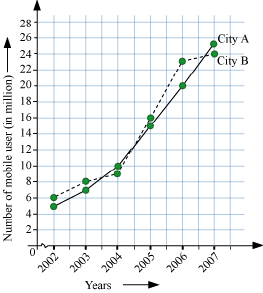
This is the required line graph of mobile users of two cities A and B in different years.
Example 2
Suhana bought a new car in 2001 for $24000. The value of her car depreciated each year as shown in the following table.
| Value of Suhana’s car | |
| Year | Value |
| 2001 | $24,000 |
| 2002 | $22,500 |
| 2003 | $19,700 |
| 2004 | $17,500 |
| 2005 | $14,500 |
| 2006 | $10,000 |
| 2007 | $5,800 |
Draw its line graph.
Solution
On the horizontal line, let us represent the years and on the vertical line, the value of Suhana’s car in dollars. We mark the points, i.e. the value of car in different years given in the above table. By joining the consecutive marked points, we obtain a graph as shown below.
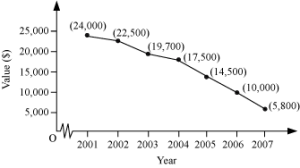
This is the required line graph of the values of Suhana’s car in different years.
Interpretation of Line Graphs
Let us look at the following line graph.

What information does this line graph represent ?
In the given line graph, the last four months of a year are represented along the horizontal axis and the profit corresponding to these months are represented along the vertical axis.
Hence, this line graph tells us the profit for the last four months of a year.
What is the total profit of these four months ?
The profit in month of September, October, November and December are 10 thousand, 40 thousand, 20 thousand, and 30 thousand rupees. Therefore, the total profit for these four months
= (10 + 40 + 20 + 30) thousand rupees
= 100 thousand rupees
= Rs. 1 lac
In which month is the profit maximum ?
The profit in October is Rs. 40 thousand. This amount is the highest as compared to the profit of other months. Therefore, the maximum profit is in October.
In this way, we can interpret information from a line graph by reading and analysing.
Now, let us discuss some examples based on interpretation of line graphs.
Example 3
The following line graph shows the temperature across the first week of March.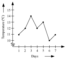
Observe the given graph and answer the following questions.
(a) On which day was the temperature maximum ?
(b) What is the trend of temperature in the beginning of the week ?
(c) Between which two consecutive days was the greatest drop in the temperature?
(d) What is the average temperature of the week ?
Solution
(a) The maximum temperature in the above line graph is 14° C. This temperature is corresponding to the third day i.e. 3rd March. Therefore, the maximum temperature was on 3rd March.
(b) On 1st March, the temperature was 11° C and on 2nd March, it rose to 12° C and then it again increased to 14° C on 3rd March. Therefore, we can say that in the beginning of the week, the temperature was rising.
(c) In the above graph, there are two pairs of consecutive days in which there was a drop in temperature. One such pair is 3rd and 4th March. Now, the drop in temperature during these consecutive days = (14 − 12)° C = 2° C. The second pair is 5th and 6th March. Now, the drop in temperature during these consecutive days =
(13 − 10)° C = 3° C. From this observation, we can say that the greatest drop in temperature was between the consecutive days 5th and 6th March.
(d) Average temperature of the week
Thus, the average temperature of the week is 11.85°C.
Example 4
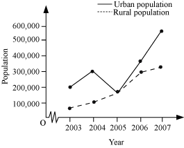
The following line graph shows the population in urban and rural areas from2003 to 2007.
Observe the given graph carefully and answer the following questions.
(a) In which year were the urban and the rural population the same ?
(b) During which year was the rural population the largest ?
(c) Which one from the urban and the rural has a continuous increase in the population growth ?
Solution
(a) In the given graph, both the graphs intersect each other at the year 2005. Hence, the urban and the rural population were same during the year 2005.
(b) In the above line graph, the year corresponding to the maximum rural population is 2007. Therefore, the rural population was the largest during the year 2007.
(c) In the above line graph, the urban population has a decrease in the year 2004-05, while the rural population increases every year. Therefore, the rural population has a continuous increase in population growth.
15.3 LINEAR GRAPHS
A line graph consists of bits of line segments joined consecutively. Sometimes the graph may be a whole unbroken line. Such a graph is called a linear graph. To draw such a line we need to locate some points on the graph sheet. We will now learn how to locate points conveniently on a graph sheet.
Location of Points In The First Quadrant
Now, let us discuss an example based on this concept
Example 5
Observe the following graph and answer the questions.
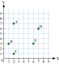
1. Write the coordinates of points A and D.
2. Which points are located by the points (1, 3), (6, 3), and (2, 1) ?
Solution
(a) A is 2 units from y-axis and 7 units from x-axis. Thus, the coordinates of A are (2, 7). D is 7 units from y-axis and 6 units from x-axis. Thus, the coordinates of D are (7, 6).
(b) The points (1, 3), (6, 3), and (2, 1) are located by the points B, E, and C respectively.
Plotting of Points on a Coordinate Plane
We know how to identify the location of points on coordinate plane. We can locate a point on the coordinate plane, if the coordinates of the point are given.
Let us learn to plot a point on a graph paper.
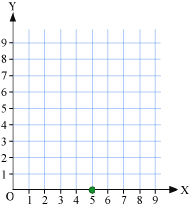
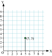
Let us plot a point P on the coordinate plane, whose coordinates are (5, 3).
The steps to plot the point are as follows.
Step1
Firstly, we draw two mutually perpendicular lines OX and OY on a graph paper, where OX is the horizontal line and OY is the vertical line and mark their intersection point as O (origin).
Step 2
Now, we mark the points on both axes. Let us choose the scale for both the axes as 1 unit = 1 cm.
Step3
We have to plot the point (5, 3). Here, the x-coordinate is 5 and the y-coordinate is 3. Starting from the origin, i.e. the point O, we will move 5 units on x-axis and mark a point there.
Step 4
From this marked point, we move vertically upwards 3 units and mark this point as shown in the figure. The point marked in this step is the required point P.
Let us discuss some more examples based on plotting of points on a coordinate plane.
Example 6
Plot the points A (2, 7), B (1, 3), C (2, 1), D (7, 6), and E (6, 3) on a coordinate plane.
Solution
To plot the point A (2, 7) on a coordinate plane, first of all we move 2 units to the right from the origin. Then we move 7 units up and we will reach at point A. This point A will represent the location of point (2, 7).
Similarly, to plot the point B (1, 3) on a coordinate plane, first of all we move 1 unit to the right from the origin. Then we move 3 units up and we will reach at point B. This point B will represent the location of point (1, 3).
To plot the point C (2, 1) on a coordinate plane, first of all we move 2 units to the right from the origin. Then we move 1 unit up and we will reach at point C. This point C will represent the location of point (2, 1).
To plot the point D (7, 6) on a coordinate plane, first of all we move 7 units to the right from the origin. Then we move 6 units up and we will reach at point D. This point D will represent the location of point (7, 6).
To plot the point E (6, 3) on a coordinate plane, first of all we move 6 units to the right from the origin. Then we move 3 units up and we will reach at point E. This point E will represent the location of point (6, 3).
The obtained points are represented in the following graph.
Verification of Points Lying on A Straight Line
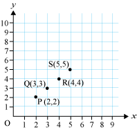
Let us consider the following points. P(2, 2), Q(3, 3), R(4, 4), and S(5, 5)
Can we check whether the given points lie on a straight line or not ?
We can do this by first plotting the points on the graph and then joining the points to see if they lie on a straight line.
Let us try to do it for the given points.
On plotting the above points, we obtain the following graph.
Now, we join all the four points using a ruler. If we can join all the points at a time using a ruler, then the points are said to lie on a straight line, else we can say that all the points do not lie on a straight line.
Let us try to do this for the points marked in the above graph.
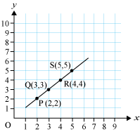
Here, we see that the points can be easily joined using a ruler and we get a straight line. Therefore, we can say that the points lie on a straight line.
Such types of graphs where the line obtained after joining the consecutive points is a straight line are known as linear graphs.
Thus, we can verify whether the given points lie on a straight line or not by using the above method which can be summarised as follows.
First of all, plot the points on a graph paper. Then join all the points on the graph. After joining these points, if the points form a linear graph, then the given points will lie on a straight line, otherwise not.
Let us discuss some examples based on linear graphs.
Example 7
Plot the points (2, 2,), (4, 3), (6, 4), and (8, 5) on a graph paper and find whether they lie on a straight line or not. Name the type of graph formed.
Solution
Firstly, plot the points (2, 2,), (4, 3), (6, 4), and (8, 5) on a graph paper and then join the consecutive points with the help of a ruler. After doing so, we obtain the following graph.
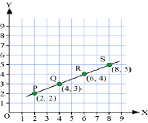
From the graph, we observe that after joining the points, we obtained a straight line. Thus, the given points lie on a straight line.
The graph formed here is a linear graph.
Example 8
Plot the following points on a graph paper and check if they lie on a straight line.
(1, 2), (3, 5), (6, 7), and (7, 8)
Solution
On plotting the points (1, 2), (3, 5), (6, 7), and (7, 8) on a graph paper, we will obtain the following graph.
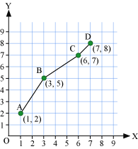
As seen here, this is not a linear graph.
Hence, the given points do not lie on a straight line.
15.4 SOME APPLICATIONS
In everyday life, you might have observed that the more you use a facility, the more you pay for it. If more electricity is consumed, the bill is bound to be high. If less electricity is used, then the bill will be easily manageable. This is an instance where one quantity affects another. Amount of electric bill depends on the quantity of electricity used. We say that the quantity of electricity is an independent variable (or sometimes control variable) and the amount of electric bill is the dependent variable. The relation between such variables can be shown through a graph.
Dependent and Independent Variables
In our daily life, we must have seen many instances where one quantity depends on another. For example,
(1) If we make more calls, then our phone bill will be high.
(2) If we purchase more quantity of a product, then the cost will be high, etc.
In the given example (1), the phone bill depends on the number of calls made by us. Here, the number of calls of phone is an independent variable and the phone bill is a dependent variable as it depends upon the number of calls we make.
We can define a dependent and an independent variable as follows.
“The variable, which changes with the change in the other variable, is called dependent variable and the other variable is called independent variable (or control variable).”
In the second example, the cost of the product depends upon the quantity of product that we purchase. Hence, the quantity of the product is an independent variable and the cost is a dependent variable.
Let us discuss an example to understand the concept of dependent and independent variables.
Example 9
Trace out the dependent and independent variables from the following situations.
(a) Time period and simple interest, where rate of interest is fixed.
(b) The area of cultivated land and the crop harvested.
(c) Speed of a person and distance covered by him in a fixed time.
(d) Amount of a material and number of particles in it.
Solution
(a) For a fixed rate of interest, if we deposit the principal for more time period, we will get more simple interest. Thus, the amount of simple interest depends upon time period. Hence, the time period is an independent variable and the simple interest is a dependent variable.
(b) If we increase the area of cultivated land, then we will harvest more amount of crop. Here, the amount of crop harvested depends upon area of land cultivated. Hence, the area of cultivated land is an independent variable and the crop harvested is a dependent variable.
(c) If a person will increase his speed, then he will cover more distance in a fixed time. Here, the distance covered by the person depends upon his speed. Hence, speed of the person is an independent variable, and the distance covered is a dependent variable.
(d) If the amount of material increases, then the number of particles also increases. Here, the number of particles depends upon the amount of material. Hence, the amount of a material is an independent variable and the number of particles present in it is a dependent variable.
Example 10
The volume of a cuboid is given by the formula V = l × b × h, where l, b, and h respectively are the length, breadth and height of the cuboid. Find the dependent and independent variables among V, l, b, and h.
Solution
If we increase the length of a cuboid, then its size will be increased and hence its volume will be increased. Similarly, if we change any side of the cuboid, then its volume will be changed. We can say that the volume of the cuboid depends on the length, breadth and height of the cuboid.
Thus, V is a dependent variable and l, b, and h are independent variables.
Graphs of Quantity and Cost of Material
We know that the cost varies with the amount of commodity we purchase. Therefore, if we buy less, we have to pay less and if we buy more, we have to pay more. This relation between the cost of a commodity and the quantity purchased can be shown through graph also.
Now, let us discuss an example.
Example 11
Draw the graph for the following table of values with suitable scale on the axes.
| Number of coconuts | 1 | 2 | 3 | 4 |
| Cost (in Rs.) | 10 | 20 | 30 | 40 |
Also find out the cost of 6 coconuts using the graph.
Solution
Let us draw two mutually perpendicular lines, i.e. x-axis and y-axis, on a graph paper. Mark the number of coconuts on the x-axis and the cost (in Rs.) on the y-axis by taking a suitable scale on both axes. On x-axis, let us take the scale as 1 unit = 1 coconut and on y-axis, 1 unit = Rs. 10.
Now, we plot the points (1, 10), (2, 20), (3, 30), and (4, 40) on the graph. By joining these points, we obtain a graph as follows.
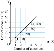
Now, to find the cost of 6 coconuts, we locate 6 on the x-axis and draw a vertical line from there till we reach the graph. Now we move horizontally till we reach the y-axis. We see that the value on the y-axis is 60 as shown in the following graph.
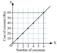
Thus, the price of 6 coconuts is Rs. 60.
Graphs of Principal and Simple Interest
We know that when the time period and the rate of interest are kept constant, the simple interest increases with increase in the amount deposited. We can draw a graph between the corresponding values of the sum deposited and the simple interest.
Let us discuss an example based on linear graph between the principal deposited and the interest obtained.
Example 12
The following table provides the information regarding the simple interest obtained on a sum deposited for a year.
| Deposit (in Rs.) | 5000 | 10000 | 15000 | 20000 |
| Simple interest (in Rs.) for a year | 200 | 400 | 600 | 800 |
Draw the graph of the given information and answer the following questions.
1. Is the graph a linear graph ?
2. Does the graph pass through the origin ?
3. Use the graph to find the interest on Rs. 12500 for a year.
4. To get an interest of Rs. 700 per year, how much money should be deposited ?
Solution
To draw the graph, let us take the sum deposited along x-axis and the simple interest obtained along y-axis using a suitable scale. Now, we plot the points (5000, 200), (10000, 400), (15000, 600), and (20000, 800). On joining the points, we obtain a graph as shown below.
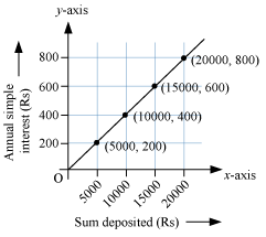
(a) The graph of the given information is a straight line. Thus, the graph is a linear graph.
(b) From the graph, we can see that it passes through the origin.
(c) To find the interest on Rs. 12500 for a year, we will locate the point 12500 on x-axis. From there, we move vertically upwards to meet the graph at a point P. From P, we move horizontally to meet the y-axis as shown below.
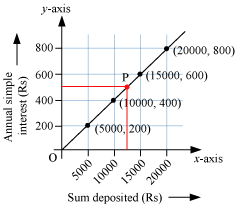
From the above graph, we can see that we will finally be at 500 on the y-axis. Thus, the interest on Rs. 12500 for a year is Rs. 500.
(d) Now, we have to find out the sum deposited to get interest as Rs. 700 per year. To do so, we will locate the point 700 on y-axis. From there, we move horizontally to meet the graph at a point Q. From Q, we move vertically downwards to meet the x-axis as shown below.
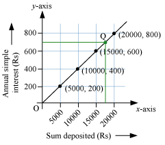
From the above graph, we can see that we will finally be at 17500 on the x-axis. Thus, the interest of Rs. 700 is obtained, when a sum of Rs. 17500 is deposited.
Distance-Time Graphs
Example 13
Ajit can ride a scooter constantly at a speed of 30 km/hour. Draw a time-distance graph for this situation. Use it to find
(i) the time taken by Ajit to ride 75 km.
(ii) the distance covered by Ajit in 3 hours 30 minutes.
Solution
We get a table of values.
| Time (in hours) | 1 | 2 | 3 | 4 |
| Distance covered (in km) | 30 | 60 | 90 | 120 |
(i) Scale : (see fig)
Horizontal : 2 units = 1 hour
Vertical : 1 unit = 10 km
(ii) Mark time on horizontal axis.
(iii) Mark distance on vertical axis.
(iv) Plot the points: (1, 30), (2, 60), (3, 90), (4, 120).
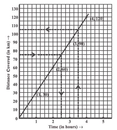
(v) Join the points. We get a linear graph.
(a) Corresponding to 75 km on the vertical axis, we get the time to be 2.5 hours on the horizontal axis. Thus 2.5 hours are needed to cover 75 km.
(b) Corresponding to hours on the horizontal axis, the distance covered is 105 km on the vertical axis.